

With so many ACE point-of-sale systems integrated to Shopify, we wanted to remind our customers about the importance of using your Shopify site to drive BOTH in-store and online sales.
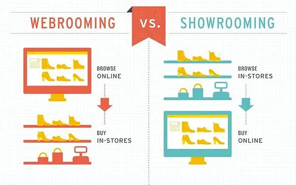
While there has been a lot of talk about the concept of “showrooming” and how shoppers browse in-store only to buy online, it’s important to remember that shoppers are also increasingly webrooming. But what is “webrooming”? It’s essentially the opposite of showrooming – researching a product online before going into a brick-and-mortar store to make the purchase. Everybody has done it at one point or another and it’s a great source of in-store traffic you don’t want to miss out on.
After all, according to Think with Google, “42% of in-store shoppers search for information online while in-store” and “almost half of those shoppers head to the retailer’s site or app” while in-store. If you mobile site doesn’t offer what shoppers are looking for and they can’t find what they need while they are physically in your store, you are likely missing out on immediate sales.
What does it mean to optimize your mobile site for webrooming?
There are many ways in which to improve the UX (user experience) for mobile users but in the case of mobile shoppers, here are 4 key factors that can be easily reviewed for immediate results:
1) Missing or irrelevant keywords
Have you ever tried searching for products using your own site? If you need to try several times or keep pulling up irrelevant results, you will want to refine yours keywords and tags to ensure that shoppers can quickly find what they are looking for. Remember to keep your keywords simple yet unique enough to avoid too many search results. Similarly, it makes sense to include commonly misspelled terms, terms that have multiple spellings (e.g. American vs. Canadian) or even terms that are frequently misspelled on mobile devices because of small smartphone keyboards.
2) Missing or hidden site search
Have you spent hours thinking about how to organize the products and categories on your Shopify site? While this is certainly important, it’s likely that shoppers are looking for something in particular or have certain questions that can be better served by keyword search. This is especially true on mobile phones where users don’t want to click through pages of products. This is an easy fix as all Shopify themes come with built-in site search or it can be added via your theme options. Remember to keep your site search visible right from your home page – users should be able to see it without scrolling.
3) Not turning on auto-complete in site search
This is another way to both speed up site search and quickly show users similar products they may be interested in via a drop-down list from the search bar. This is a great way to improve search results for commonly misspelled items or cross-sell products by attribute.
4) Forgetting that customers are typing and viewing on small screens
This can’t be said enough – everything on your site must be easily viewable and legible in mobile format. This means keeping your images and text simple as nobody wants to have to zoom in to see your products or read an essay for descriptions. Keep your home page simple yet with enough features above the fold (without the need to scroll) to increase customer satisfaction and close more sales.
Lastly, always test out your mobile site on different devices with different types of customers to make sure the user experience is always similar. Happy retailing!